I took books’ information from the MySQL database and tried to analyze the relation between price, score, and the number of commentators. The books’ sales information is collected from amazon as described in the article Find The Book Wanted In Amazon By Python, you can read it if you are interested about the entire process.
The information of the books that the number of commentators is larger than 500. I used the Pearson correlation coefficient to explore the relation between prices and the number of commentators. If the value of P is smaller than 0.05, we think they are relevant to each other. If the value of R is close to 1, they have a positive correlation, -1 means a negative correlation.
![\[R = \frac{cov(X, Y)}{D_XD_Y}\]](https://www.weiy.city/wp-content/ql-cache/quicklatex.com-8a18ecfcfd942416e229d762eb5b932b_l3.png "Rendered by QuickLaTeX.com")
#! /usr/local/bin/python3
# -*- coding: utf-8 -*-


import numpy as np
import pymysql
import matplotlib.pyplot as plt
from scipy.stats import pearsonr

def CollectData():
    db = pymysql.connect(host='localhost', port=3306, user='root', password='wy19941212', database='PySpider')
    cur = db.cursor()
    sql = 'SELECT price, score, menCount FROM Books ' \
          'where menCount > 500 ' \
          'order by price'
    cur.execute(sql)
    books = cur.fetchall()
    prices = []
    scores = []
    menCounts = []
    for book in books:
        prices.append( book[0] )
        scores.append( book[1] )
        menCounts.append( book[2] )

    cur.close()
    db.close()
    return prices, scores, menCounts

if __name__ == '__main__':
    prices, scores, menCounts = CollectData()

    result = pearsonr( prices, menCounts )
    print( 'R: ' + str(result[0]) + ', P: ' + str(result[1])  )

    x = np.arange( 0, len( prices ) )

    plt.plot( x, prices, color='r', label = 'prices' )
    #plt.plot( x, scores, color='b', label = 'scores' )
    plt.legend( loc='upper left' )
    plt.twinx()

    plt.plot( x, menCounts, color='g', label = 'menCounts' )
    plt.legend( loc='upper right' )
    plt.show()
output:
R: 0.08706866124259607, P: 0.06350280339889768
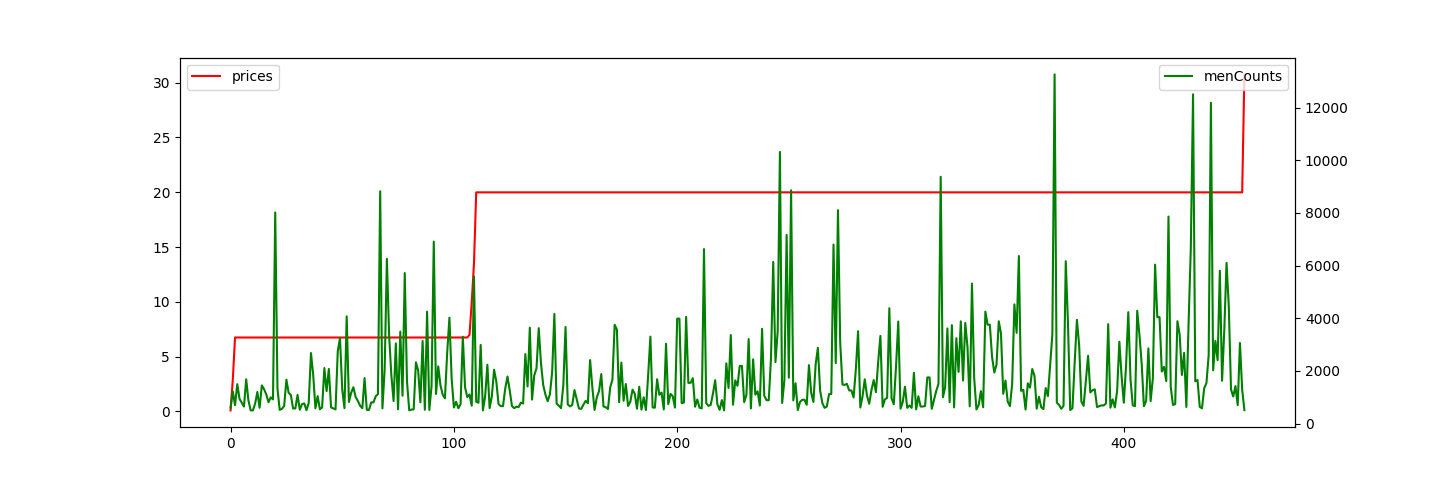
The value of P is larger than 0.05, so the prices and the number of commentators have not relationship.
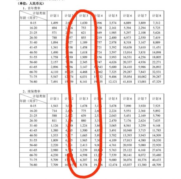
Let’s see another example, the following picture shows a table about the age of buying insurance and cost.
#! /usr/local/bin/python3
# -*- coding: utf-8 -*-

import numpy as np
import matplotlib.pyplot as plt
from scipy.stats import pearsonr

if __name__ == '__main__':
    ages = [25, 30, 40, 45, 50, 55, 60, 65, 70, 75, 80]
    costs = [621, 855, 1189, 1458, 1618, 1909, 2345, 3147, 4468, 6031, 8141]
    x = np.arange( 0, len(ages) )

    result = pearsonr( ages, costs )
    print( 'R: ' + str(result[0]) + ', P: ' + str(result[1]) )

    plt.plot( x, ages, color='r', label = 'ages' )
    plt.legend( loc='upper left' )
    plt.twinx()

    plt.plot( x, costs, color='g', label = 'costs' )
    plt.legend( loc='upper right' )
    plt.show()
output:
R: 0.8896776681953972, P: 0.00024510246425286464
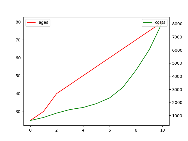
We can see that P < 0.05 and R is approximately equal to 0.89, so the cost is more if the buyer is older in the age range [25, 80].